256 KiB
Exercise
Intro
This exercise is taken from a project example where shear forces in a shell element from a Sofistik Finite Element calcuatation are extracted and plotted into one figure per Construction Stage.
The purpose of this procedure to give a quick overview of the results after a calculation has finished, and to be able to flip through the Construction Stages to easily compare them.
There are in total 56 Construction Stages in the dataset used and three different shear keys, resulting in 168 plots.
Each plot will look something like this:
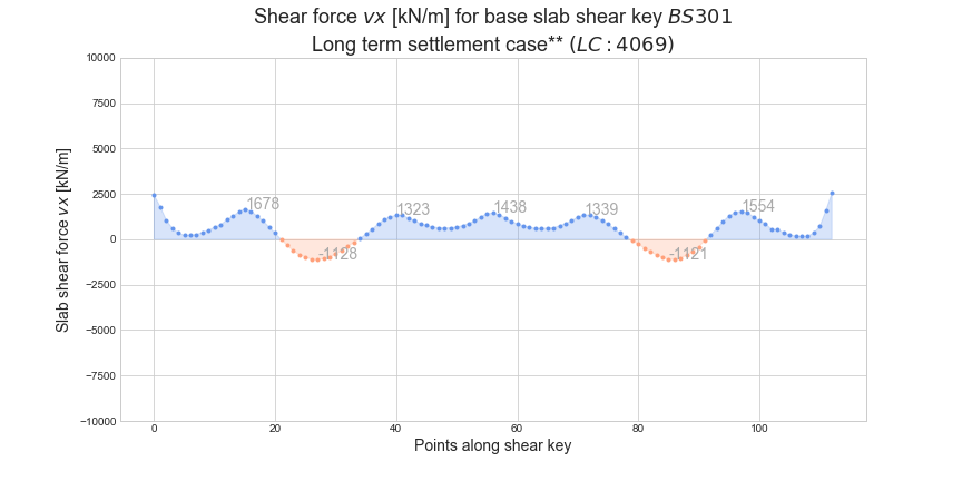
Some plots will be almost empty as loads are close to zero in some Stages.
The dataset is called shear_keys_base_slab_v20.txt and can be found in the Session 6 folder for the workshop.
Note: Understanding the structural context of the dataset is not important for solving the exercise. The same concepts could be used for all other types of datasets.
The exercise
The code comments and some parts of the actual code from the original script is given below.
Copy this direcly into the editor to use as a guide through the exercise.
# Import libraries
import pandas as pd
import matplotlib.pyplot as plt
import numpy as np

# Set style for matplotlib plots
plt.style.use('seaborn-whitegrid')

# Dictionary for mapping node numbers to user chosen shear key names
shear_keys = {
              # Shear key in Base Slab 101
              'BS101': range(10101, 10199),

              # Shear key in Base Slab 201
              'BS201': range(20101, 20199),

              # Shear key in Base Slab 301
              'BS301': range(30101, 30214),
}

# Set file name of dataset
file_name = 'shear_keys_base_slab_v20.txt'

# Read dataset from text file into dataframe, save it as 'df'
    #     <Code here!>

# Extract version number from file name as 'vXX'
# (assume the last 6 characters will always be '...vXX.txt')
    #     <Code here!>

# Print the head of the dataframe to check it
    #     <Code here!>

# Contruct a dictionary that maps load case numbers to titles (auto removes duplicates)
lc_no_to_title_map = dict(zip(df['LC'], df['LC-title']))

# Loop over all shear key names and their corresponding node numbers
for shear_key, nodes in shear_keys.items():

    # Loop over all load cases, create plots and save them to a png-file
    for lc in df['LC'].unique():

        # Get title of current load case from mapping dictionary
            #    <Code here!>    (see hint 1 below)

        # Filter dataframe based on load case and nodes in shear key
            #    <Code here!>    (see hint 2 below)

        # Create figure
            #    <Code here!>

        # Create x-values for plot as numbers running from 1 to length of y-values
            #    <Code here!>

        # Create y-values for plot as shear forces vx
            #    <Code here!>

        # Extract indices where y-values are negative and positive, respectively
        idx_neg = np.where(y<0)
        idx_pos = np.where(y>=0)

        # Extract x-values where y-values are negative and positive, respectively
        x_neg, x_pos = np.take(x, idx_neg)[0], np.take(x, idx_pos)[0]

        # Extract y-values where y-values are negative and positive, respectively
        y_neg, y_pos = np.take(y, idx_neg)[0], np.take(y, idx_pos)[0]

        # Plot points for negative and positve values as two separate data series
            #    <Code here!>

        # Fill between y=0 and the lines where y-values are negative and positive, respectively
            #    <Code here!>

        # Set titles and x- and y-labels
            #    <Code here!>

        # Save figure to png-file with meaningful name that varies in every loop
            #    <Code here!>
The hints below refer to the comments in the code above.
Hint 1: The dictionary 'lc_no_to_title_map' has load case numbers as keys and the corresponding titles as values. Use this to get the load case title from inside the loop.
Hint 2: Be sure to save the filtered dataframe to a new variable. If it is saved to a variable of the same name it will be mutated in every loop and quickly end up emtpty.
Some improvements
- Comparison between the plots could be improved by having the same limits for the y-axis on all plots. This can be set by
ax.set_ylim()
- The function below can find the indices of the peak values, which can be used to annotate the key points to make the plot more readable.
def find_local_extrema(y_curve):
    '''
    Return indices of all local extrema for the given sequence of values. Indices are sorted in
    ascending format with no distinction between local maximum and minimum.
    '''
    local_max, _ = find_peaks(y_curve, height=0)
    local_min, _ = find_peaks(-y_curve, height=0)
    return sorted( np.append(local_min, local_max) )
Prior to running the function, find_peaks from the scipy library must be imported: from scipy.signal import find_peaks
After having found the extrema values, they can be annotated like so:
for extr_val in extrema_values:
    ax.annotate(f'{y[extr_val]:.0f}', xy=(x[extr_val], y[extr_val]), xytext=(x[extr_val], y[extr_val]))